Beautiful Wreck: 587 Jersey, Noe Valley

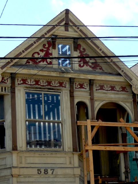
Walking my dog, yesterday afternoon and I was brought up short by this beautiful wreck around the corner from where we live.

P1010087

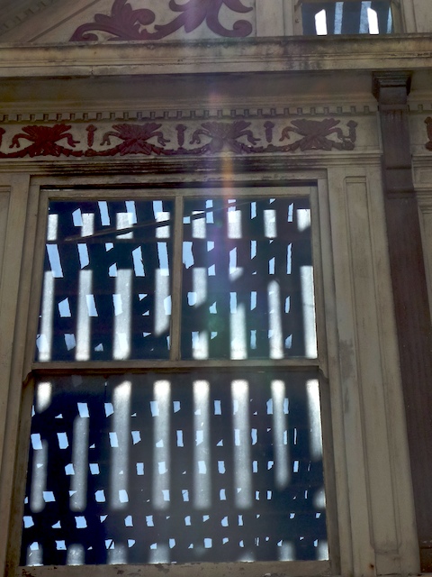
Light and shadow from the rafters seemed to make the windows glow like cardboard cut-outs.

P1010088

Here’s the scoop:  Listed in mid-May for $799,000, sold on June 25 for $700,000.  1360 square feet of original detail.  $515 bucks a foot.

I quote from the listing:  “All inside doors, most hardware, some light fixtures appear original and possibly pre-1900.”

Not any more, it seems….

Did you like this? Share it:
Posted in Listings | Tagged , | 2 Comments

Update on What $2.1 Million Buys in Noe Valley — (now it’s under $2 million)

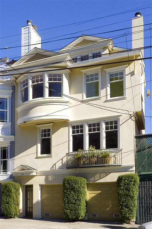
Back in February I posted about two $2.1 million homes offered for sale in my ‘hood. 731 Douglass had 3,000 square feet of good, livable space and the sorts of finishes and flourishes  you’d expect.  But it had no back yard and was located on the fairly busy corner of 24th Street and Douglass, with a Muni stop and Noe Valley Courts’ sand-pit within spitting distance of the front windows.

731-douglass-now

731 Douglass

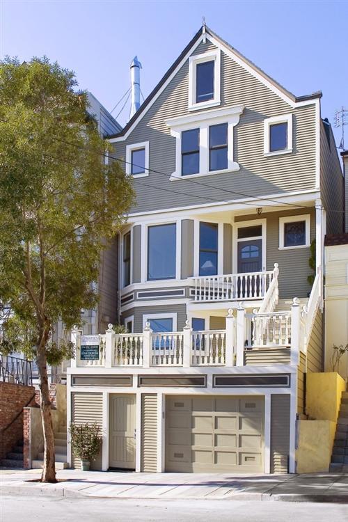
Meanwhile 110 Hoffman, offered at just $2,000 less than Douglass, had a little less space and a vertical, less user-friendly lay-out.  But, location it had in spades, on one of Noe’s best and quietest streets.  Plus it had a spacious back yard with a lovely mature tree.

110 Hoffman

110 Hoffman

My good friend and blogging critic, Mike Dashe  — the American part of the Franco-American wine-making duo who own Dashe Cellars — recently took me to task for not doing what any good story-teller does: tell ’em how it ends.  So here’s the final chapter folks.

731 Douglass came in first, selling for a respectable $1.85 million, or 85% of the listing price after just 48 days.  Good show!  Though it’s worth noting that this was a cool $100,000 LESS than it sold for back in March 2005, when it was on the market for just 18 days.  (There’s more proof of the correlation between price and DOM — days on market — see my previous post.)

110 Hoffman had a more torturous ride to the finish-line.  Originally listed at $2.395 million, it suffered two price drops and was ultimately withdrawn from the market 102 days later when it failed to sell at $2.148. Fast-forward five months to July and it’s back on the market at $1.995.  And, after falling in and out of contract, and back in —  it sells for….

$1,995,000.  Full list price and all within 10 days if the MLS Database can be believed.

That’s a cool $100k more than 731 Douglass.

What went on here?  I honestly don’t think this was a case of location trumping space.  Instead, it’s about timing.  731 Douglass went on the market in January and sold in March.  Prices generally fall somewhat during winter months.  But much more importantly, does anyone remember how the financial world was coming to an end right at that time? The stock market was dropping like a stone and no one knew where it would end.  (In fact, the S&P 500 hit bottom on March 9.)

I remember when I had the misfortune of putting the first property I ever owned on the market not long after 9/11/01.  I’m convinced that it sold for around $300k less than it would have at any other time.

Seen in this light, it sure seems like the owners (and the agent) of 110 Hoffman made the right decision to bide their time.  A few months later, the sun breaks out literally and metaphorically and things are moving again. Here’s a case where the tortoise beat the hare.

And speaking of odd-looking creatures, let’s get back to Dashe Cellars and their beautiful wines (you gotta try their single vineyard Zins.)  Mike, would you care to explain what’s with the monkey and the, ahem, “whale?”

Picture 5

Did you like this? Share it:
Posted in Listings | Tagged , , , | 1 Comment

San Francisco’s Luxury Home Market

chateau-chenonceau

Every time there’s a housing slump, there’s discussion about whether the top end or the bottom end is fairing better or worse.  Here’s a June 2009 article from The Examiner, declaring that luxury home prices in SF are picking up.  And here’s a report published by First Republic Bank, which puts out a so-called “prestige home index,” for various cities in California, stating that luxury home prices in San Francisco continue to fall.  Here’s the accompanying chart from First Republic.
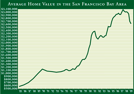
prestige-sf

And around the beginning of the year, the folks at Paragon Real Estate published an interesting report, How_Much_Have_San_Francisco_Home_Values_Declined_Feb_09,  that broke down price declines based on price range.

But what really constitutes “the luxury market” in a town where you can’t buy a shack for less than half a mill and where the average price for a home was over $1 million in July?

To begin to answer these questions, I first looked at the distribution of sales prices over the last few years. I wanted to create a “snapshot” of the overall market, while including enough data to make the results meaningful.  Here’s a chart that shows how sales were distributed in each price category.
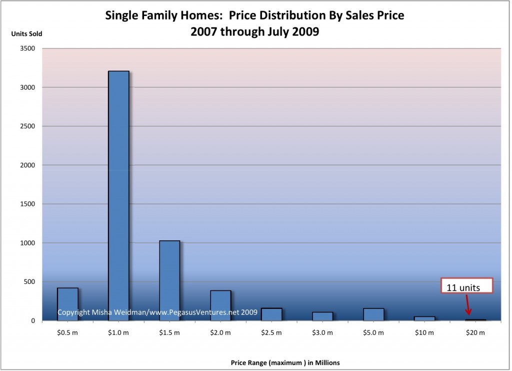
Luxury Market price ranges

Clearly, and not surprisingly, the vast majority of properties sold in the $501,000 to $1.5 million range.  In fact, out of 5,532 home sales over a two-and-a-half year period, only 489, or 8.8% sold for over $2 million.  Over $5 million?  Just 64 sales.

Again, not surprising.  $5 million is a lot of mullah in anybody’s language, though this is a pretty toney town and looking at the mansions up at Pac Heights and Seacliffe (I added the “e”, thank you very much), I expected that there would be more sales in the stratospheric range.

But there aren’t, so whadyagoingtodo?  First, you’re going to be very careful about jumping to any conclusions, because there just isn’t a lot of data.  What’s more, properties at these price levels really do tend to be “unique” – that’s part of their value — and they don’t turn over frequently. This increases the difficulty of reaching meaningful conclusions about price fluctuations in this high-flying, thinly traded market.

Now that we’re done with the disclaimers, let’s see what I came up with.  I picked a minimum sales price of $5 million as fitting the definition of “luxury” rather than just very expensive.

First, I looked at sales volume, another of those metrics frequently discussed in the context of price fluctuations.  The assumption is that when there are a lot of sales prices tend to go up; fewer sales, prices go down.
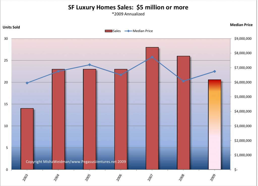
Luxury Market - Sales v Price

Clearly, sales volume is down for 2009 on an annualized basis, but prices have nevertheless increased from 2008.  Not much of a correlation there.

Next I looked at the average number of days on the market (“DOM”) for these properties to sell.  In a previous post, I’ve argued that this metric really does seem to have a strong inverse correlation with price:  if it’s taking longer for houses to sell, prices tend to go down; if houses are selling quickly, prices tend to go up. The following chart shows DOM plotted on the right-hand axis with the time-scale reversed so that longer time periods are at the bottom and shorter periods are at the top.  I’ve also shown the number of units sold per year.
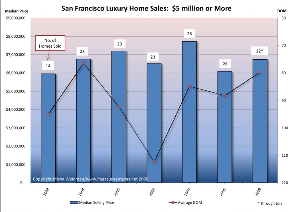
Luxury Market - Sales v DOM

Here things seem to line up pretty well.  In 2009 so far, there’s been a shortening of DOM and prices have recovered somewhat from 2008.  But again, we’re working with very small numbers of sales, so I’d be careful drawing any definitive conclusions.  In fact, if you just focus on the median sales price, it seems to me that prices have remained pretty much within the same band of value since 2004, except for a spike in 2007 when the overall market was at its hottest.

So, gentle reader, next time you’re shopping for that $5 million house, don’t expect to pick it up at fire sale prices.

As for the rest of us, the truth is that pretty much anyone who can afford a house in San Francisco is already living in luxury.

Did you like this? Share it:
Posted in Market news | Tagged | 1 Comment

Homes vs. Condominiums: How much extra do you pay?

Recently, I blogged about the fact that condominiums seemed to be holding up better than single family homes in terms of their decline from their all-time highs.

At the same time, I noted that there was only about $100,000 difference in median value between condos and homes.  That seemed like a small delta and I was interested to see whether it was, historically speaking.  Turns out that it is.

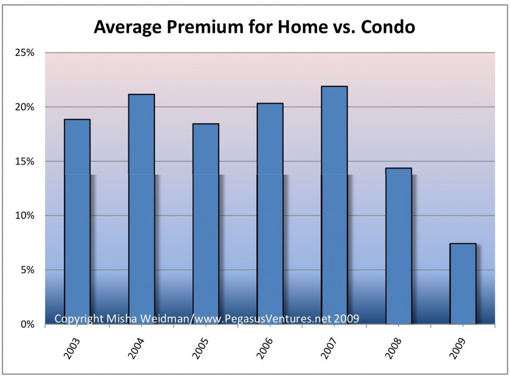
Since, until recently (ahem!), home prices along with everything else have tended to go up, I decided not to look simply at the difference in price between condos and homes.  Instead, I converted the price difference to a percentage of the median value of condos sales for the given period.  This represents the “premium” for owning a home rather than a condo.  Here’s the result.

Average Premium for Home vs Condo

Sure enough, you’d normally expect to pay around 20% more for a home than for a condo.  But starting in 2008, the home “premium” started dropping significantly.  I believe that drop was a direct reflection of the housing market decline that began with homes and only subsequently spread to condos.  As I postulated in my blog, condo values possibly held up for longer as people got squeezed out of the single family home market by tightening credit standards.

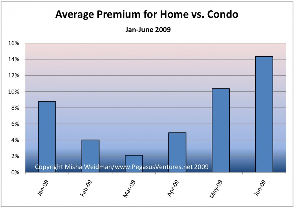
But what about 2009?  The chart above shows the premium based on all sales for the year to date.  The picture looks a little different if you look at values on a monthly basis.

Average Premium for Home vs Condo 2009

Again this is consistent with my previous blog.  It suggests while that condo values may have held up longer, they too have fallen so that the premium paid for a home is now heading back to its historic norm.  Of course, the other possibility is that home prices are beginning to recover.  It may well be that both explanations are true.

Did you like this? Share it:
Posted in Condominiums | Tagged , | Leave a comment

Heat Map of San Francisco Foreclosures

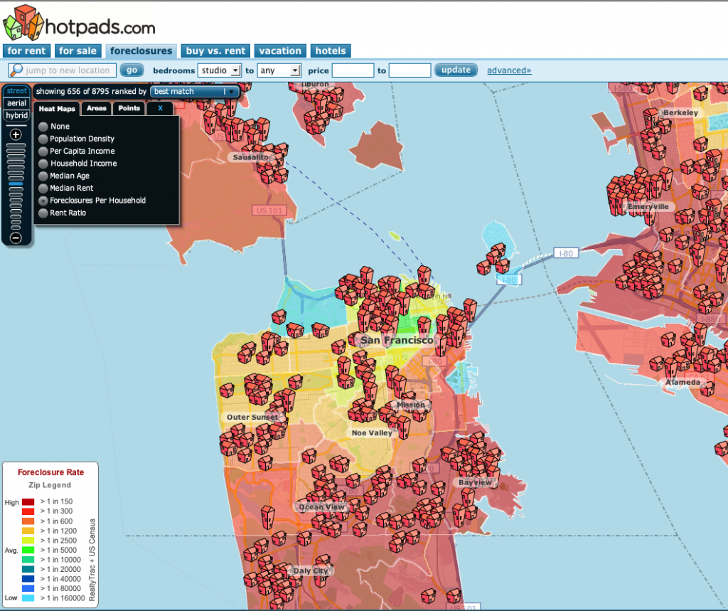
There’s been a fair bit of discussion on various real estate blogs about the state of foreclosures in San Francisco.  Here’s a picture of SF, courtesy of Hotpads, on our little patch of heaven.

Picture 2

Core SF neighborhoods seem to be doing OK, though worse than “average” — not defined by Hotpads as best as I could tell.  Outer neighborhoods are not doing so well.

The big surprise is the amount of red over in Marin, including toney areas like Sausalito and Mill Valley.  Frankly, I’m skeptical; it just doesn’t add up.  There’s not a lot of information on the free part of their website on their methodology though I believe they’re using data from Realtytrac, which has its own fee-based foreclosure radar website.  If I come up with better information I’ll update this posting.

Did you like this? Share it:
Posted in foreclosure | Tagged | 1 Comment

The Worst May Be Over According to Big Brain, Ken Rosen

male_brain

Ken Rosen, Chair of the Fisher School For Urban Economics over at UC Berkeley, has good news for San Francisco home owners.  “The recent rise in home prices and sales activity lead us to believe that the worst part of the correction in home prices is behind us and that housing market conditions are showing signs of improvement.”

This report, based on June results, is the first of what will be a monthly analysis of the San Francisco real estate market undertaken by The  Rosen Consulting Group on behalf of The San Francisco Association of Realtors.  You can download it here.

I’m a big fan of Rosen.   I listen to him speak once or twice a year at a real estate symposium put on by the Fisher School; he and others bring a level of sophistication and breadth of view to the analysis of the real estate market that is hard to find when we are toiling in our own back yards.  I blogged on his predictions about the market  in a couple of posts entitled The View From Space at the end of last year.  Does that mean you won’t be needing me to crunch the numbers any more, gentle reader?  Not necessarily:  I believe the report miscalculated the median year-over-year price change for single family homes from June 08 to 09.  Rosen says it’s 6.8% down.  SFAR’s own numbers put it at 4.9%.  (I have us down 5.7%:  some discrepancies, alas, are inevitable — a result of delays in agents and brokers putting “sold” information into the MLS system from which all this data is derived.)  Anyway, I’ve notified SFAR — we’ll see what happens.  Besides, I’ll continue to try to get as fine-grained as I can in my analyses.  Rosen is a big picture guy.

Quibbles notwithstanding, Rosen makes some interesting points and one of them has caused me to rethink a previous post of mine.

His report points out that nearly a quarter of active and closed sales in June were in District 10, which encompasses “distressed” areas like the Bayview and Hunters Point.  Back in May, I argued against the commonly-heard thesis that District 10, along with District 3, were dragging down values in the city as a whole.  My chart showed that the City taken as a whole was about as far off its all-time high as Districts 3 and 10 were off of theirs.  Well, I was right.  And wrong.

It turns out that both statements are true:  Districts 3 and 10 were doing no worse than the city as a whole in terms of where they were relative to their all-time highs.  But it’s also true that the high volume of low-priced sales in those districts, combined with many fewer sales at the top end of the market, did pull down the median value for the City as a whole.   How did I miss it?  I didn’t look at the distribution of sales across the various districts. Rather, I compared the medians for each data set without looking at relative sales volumes.

Data analysis is tricky stuff.  It’s easy to pick and choose your metrics to match your agenda.  But it’s just as easy to miss a detail that changes the picture considerably.

Here are some more tidbits from the report:

  • Despite the concentration of low-price sales in Districts 10, there has been a significant jump in sales volume in high priced Districts 5 and 7, which encompass neighborhoods like Noe Valley and the Marina.
  • The large number of condos on the market from new down-town and SOMA high rise projects is continuing to put downward pressure on condo values.
  • Rosen expects home prices to be soft but to continue to improve through the remainder of the year.  “With for-sale inventory still at elevated levels and expectations for a continued rise in the unemployment rate through the end of this year, buyers will still have good purchasing opportunities.”

I got that part right.

Did you like this? Share it:
Posted in Economy, Market news | Tagged , , , , , , , , | 1 Comment

Case Shiller Chimes in With Good News: US Down only 17%!

Picture 1

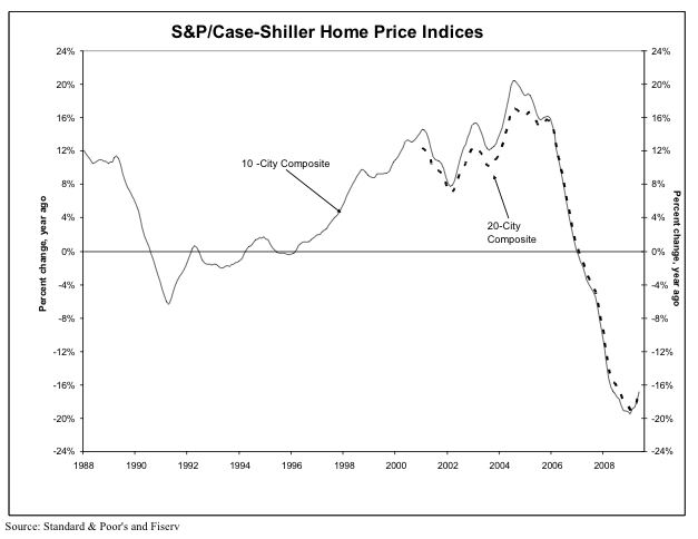
Case-Shiller published its closely watched indices yesterday.  Hooray! The broadest CS index shows that the rate of decline in the nation’s largest housing markets has reversed in recent months.  Now we’re only going down 16% year over year instead of 20%.

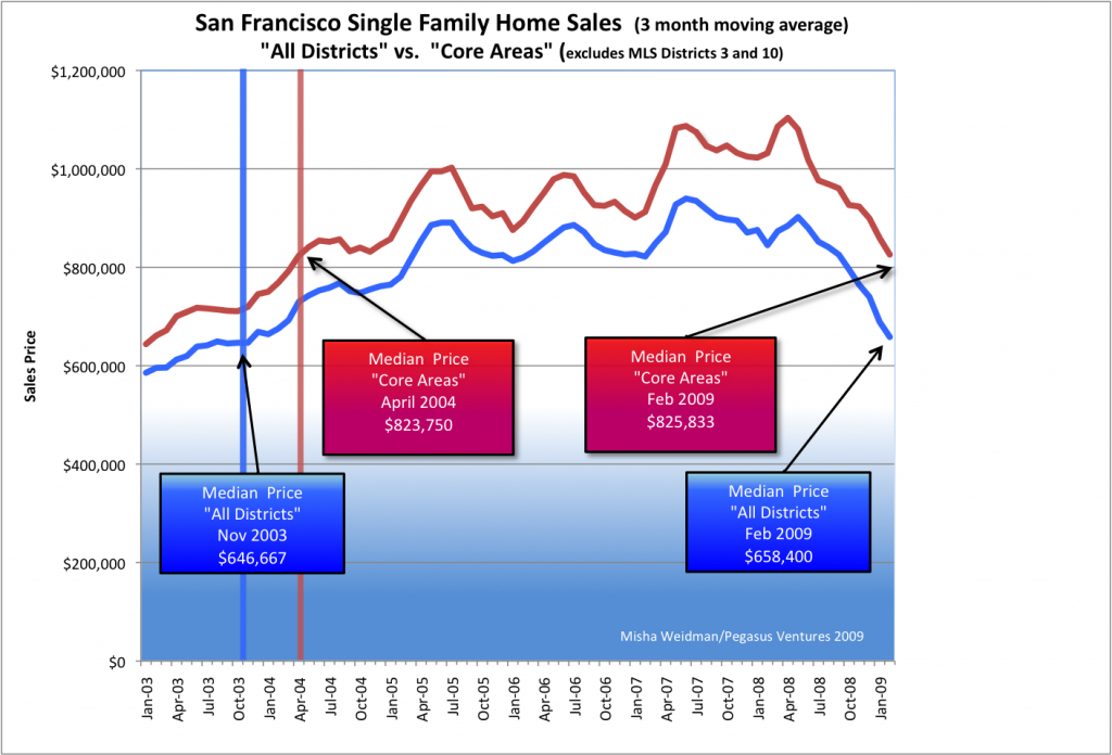
They also point out that we are now back to 2003 values, which also holds true of San Francisco.  Here’s my chart from an April blog:

Core Area Medians vs All Districts

Before you go out and celebrate, Case-Shiller has “San Francisco” down a whopping 26.1% year over year.  Why the quotes?  Because it’s really the “San Francisco-Oakland-Fremont, CA Metropolitan Statistical Area” and it includes ALL of Alameda, Contra Costa, Marin, San Mateo, and … San Francisco County. That’s 5 counties folks, a factoid often omitted even by such august publications as the New York Times (see today’s front page article).

Now here’s the “good” news.  My data says that the San Francisco we live in was down “just” 5.7% in June 09 year over year for homes.  Take a look under the Market Trends tab for annual and monthly data for the City and specific MLS Districts.  (By contrast, condos are down 15% year over year.  That also happens to be how much they’re down from their all-time highs, which occurred right about a year ago.  See my previous post.

Did you like this? Share it:
Posted in Economy, Market news | Tagged , | Leave a comment

Surprise! Condos are Holding Up Better Than Homes

For the quarter century (gulp!) that I’ve been involved in real estate, the conventional wisdom has always been that condo values generally do worse in down markets than homes.  Why?  To be honest, I’m not sure, but I think it’s because it’s easier to overbuild the condo market than the single family home market.  It goes back to that famous quote:  “Buy land – they aren’t making any more of it.”  Just take a look at Miami, Chicago – or downtown San Francisco.  One new high-rise can hold hundreds of condos in the sky.  Try building just one new home in SF, let alone hundreds – it aint happening.Of course, more supply  + less demand in a down market means prices fall.  Has that been the case in San Francisco?

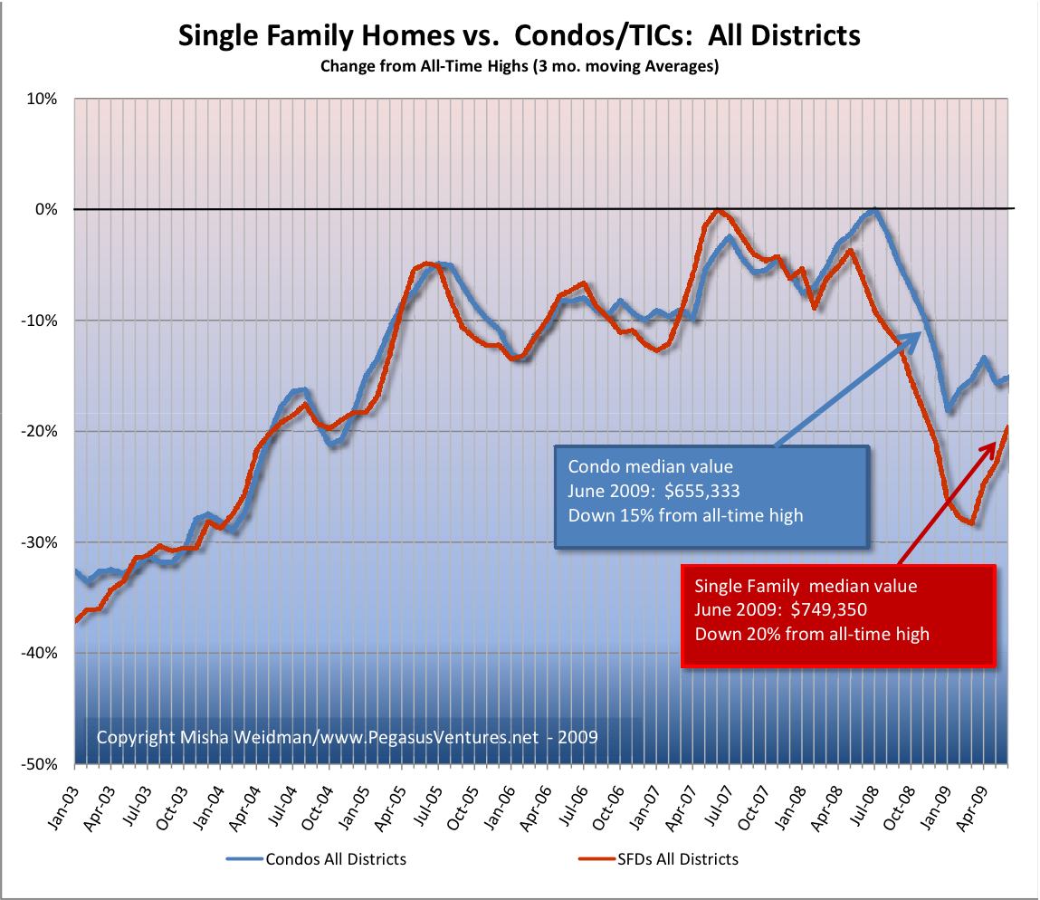
I looked at percentage change from all time highs for condos and single family homes (sfd’s) since January 2003 and here are the results for the city as a whole.

Condos vs. SFDs All Districts Chart

Until June 2008, condo and home prices were in lock-step in terms of price appreciation and decline.   Thereafter, homes fell first and further. (Do I hear a lithp?) In March 2009, the delta between condos and home prices was a whopping 13%.  Since then, however, home prices have recovered smartly:  as of June, homes are about 4.5% further off their all-time highs than condos.

What does this all mean?  First of all, I wouldn’t take too much consolation just yet in the upward spike in both condo and home prices since the beginning of the year.  If you take a look at the chart, this happens every Jan/Feb when people start buying out of the winter doldrums.  I wouldn’t predict a bottom until we see what happens this winter.

Secondly, given the woeful condition of the economy and the credit markets, together with the fact that San Francisco is not a badly overbuilt housing market, it sort of makes sense that condos are holding their value relatively well as people are finding themselves priced out of more expensive single family homes.

Still, the current delta of only $100,000 between median condo and median home prices seems rather small.  If people are just begging to know what the historical average is, let me know and I’ll find out.

Did you like this? Share it:
Posted in Condominiums, Data, Market news | Tagged , , , , , , , | 7 Comments

Went Fishing

fish

For the three-and-a-half readers who may have wondered what happened to me, I’ve been up in the Sierras near Yosemite with my family at the wonderful San Francisco treasure, Camp Mather, a 9 mile bike-ride from Hetch-Hetchy reservoir, where San Francisco gets its world-class water from, and about a 45 minute drive from Yosemite.

No cell-phone service, no wi-fi.  Just lots of trees, sun, rock, and river.

Spent about 7 hours fly-fishing over two days and caught 3 fry and 1 bona-fide fish, probably not bigger than 9″.  (All were released.)

Fly-fishing has to be one of mankind’s greatest exercises in frustration.  How could we possibly make fishing more complicated.  Don’t use real bait, use tiny strings, beads, and feathers instead.  Don’t pick the right pattern, don’t get a fish.  Don’t “present” the fly naturally on the water, don’t get a fish.  Do all this will flinging 15 to 30 feet of line over your head while waist-deep in freezing water, surrounded by bushes, trees, rocks, and all manner of other obstacles that want to do nothing more than EAT YOUR FLY.

I had a blast!

The database for SF condos is almost complete, so I’ll be able to start reporting on that part of the market soon.  Still working on automating my district charts to that I can generate compartive charts more quickly.

mather-1

Did you like this? Share it:

Posted in Blogging, Personal | Tagged | Leave a comment

Cole and Noe Valley Go Head to Head

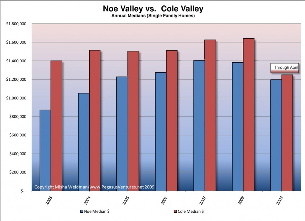
It seems only fitting that since my last few posts have focused on Cole Valley and Noe Valley, we should take a look at them head to head. Since Cole Valley has relatively few monthly sales, I’ve compared median values on an annual basis. Here are the results (click):

cole-valley-vs-noe-valley-annual-chart

Say what you want about the two valleys, you’re going to pay more if you live in Cole. About $200,000 more, to be precise. Before you conclude that the premium all but vanished in 2009, remember that there have only been five Cole Valley home sales so far this year. Way too few to conclude anything other than that nothing’s selling or that homeowners are so addicted to the breads and pastries at La Boulange that they can’t leave.

Did you like this? Share it:
Posted in Data, Uncategorized | Tagged , | Leave a comment