One of the Other Things I Do: Windsor Live+Work

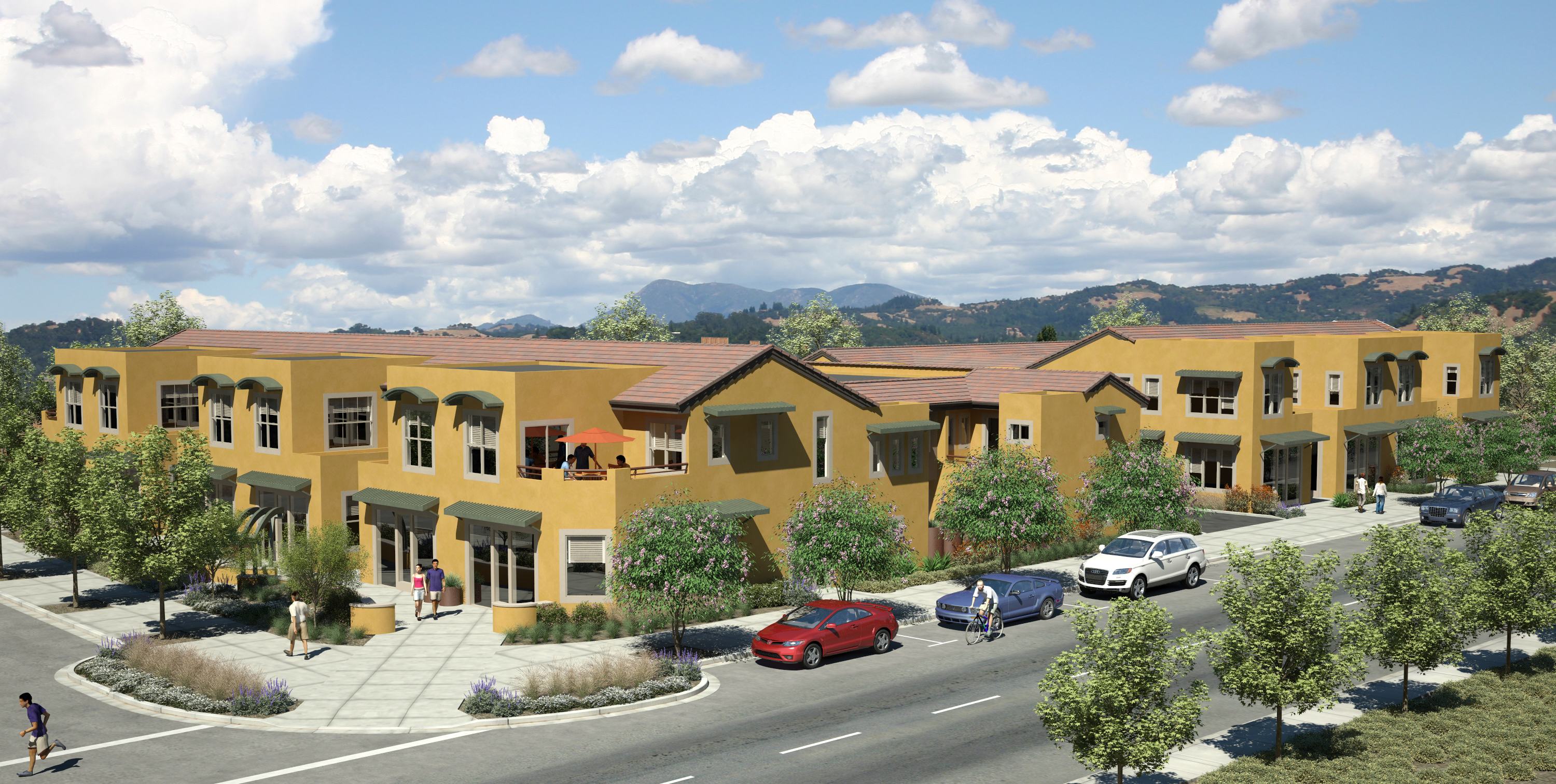
I’ve been itching to do some posts and I have some interesting info coming on TICS (Tenancy-In-Common Interests) vs.  condos.  However, the last few weeks have been taken up readying my development project, Windsor Live+Work, for a major re-submission to the Town of Windsor (we’re talking just north of Santa Rosa, folks, not the seat of the British Monarch).  Windsor Live+Work is a 12 unit live/work project that combines some beautiful and innovative architectural design with forward-thinking urban planning ideas and “green” construction standards.  Here’s the 3D rendering, which I received just last week (click — it looks really good big!).

Windsor Live+Work

Windsor Live+Work

Stay tuned for new posts and charts in the next few days.

Did you like this? Share it:
Posted in development, Personal | Tagged , | 2 Comments

Enough about Owning — How about San Francisco Rentals?

I came across a site recently that not only provides a database of available rental units for many US cities, but also has nice, easy-to-read charts on rental trends for specific areas.  Unfortunately, you can’t get very precise in terms of zip code or neighborhood, but it certainly give you a good sense of rental trends.  And trends, as we all know, are what it’s all about!

Welcome to RentBits.com:

I’ve added them to my blog-roll.

Did you like this? Share it:
No tags for this post.
Posted in Uncategorized | Leave a comment

Dead Cat Bounce?

deadcatbounce

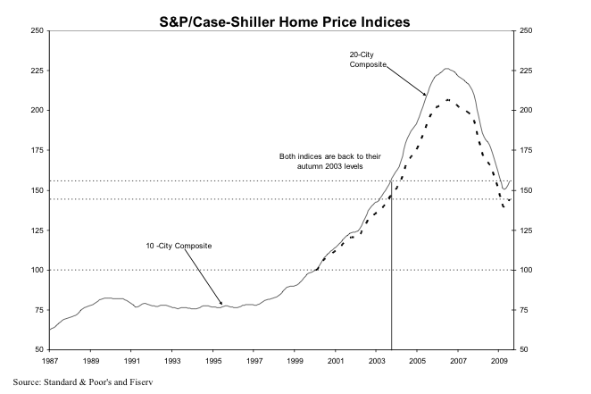
At the end of last month, the media was full of Case-Shiller’s upbeat report on the national housing market for July 2009, its most recent reporting month. Three months of improving sales “continue to support an indication of stabilization in national real estate values,” according to the September Report.

Here’s the chart, by the way, which also shows that on a national basis we are back to Autumn 2003 price levels.
Picture 3

See that little up-tick at the very end of down side of the mountain?  That’s what every one is celebrating, folks.  Indeed, it’s hard not to laugh when the Report includes tortured phrases like “the rate of annual decline … seems to be decelerating”  or “all metro areas are showing an improvement in the annual rates of return, as seen through a moderation in their annual declines.” Whoopee!

Locally, “San Francisco” — keep in mind that for the CS Index, this means 5 of the 9 Bay Area Counties — posted its fifth straight gain, with a seasonally adjusted gain of 2.9% over June 09, which followed a seasonally adjusted gain of 3.2% in June over May.  Before you break out the champagne, “San Francisco” was still down 17.9% year over year.

This is now old news.  But in this Sunday’s New York Times, Mr. Shiller mused about what all this meant for the real estate market. The article is not a model of clarity, but Shiller’s conclusion is pretty stark:  “At the moment, it appears that the extreme ups and downs of the housing market have turned many Americans into housing speculators.”  He suggests that people are looking at the huge amount of money the fed is pumping into the system, the first-time home-buyer tax credits, and other short-term infusions, and basically “trying  to time their home-buying decisions” and thus artificially causing the spike in prices. Here’s the takeaway:   “The sudden turn could signal a new housing boom, but it is more likely just a sign of a period of higher short-run price volatility.”

Indeed, after noting that the recent change in direction in the CS Index is the sharpest he’s ever seen, he takes a look at the last time a similar turnaround occurred.  It was at the end of the last housing bust, after the 1990-91 recession.  Five years later, however, home prices were down 13.8% in inflation-adjusted terms from the highs they’d reached in the “turnaround” month.

Meanwhile, the stock market continues its giddy gains — perhaps for many of the same reasons as the housing market has bounced back.

Personally, I’m not terribly fond of cats, but if I owned one I’d be keeping it away from any open windows.

Did you like this? Share it:
Posted in Economy, Market news | Tagged | 3 Comments

“Misha’s Musings” Becomes “Real Data SF”

And now a brief announcement from your sponsor….  I managed to snag www.realdatasf.com a few months ago in what, if I recall correctly, was a brief moment of late-night single-malt-scotch-induced inspiration.  Though I cannot deny the allure of the alliterative, “Misha’s Musings” was always meant as a place-holder till something better came along.  For those of you who are sorry to see the old name go, keep in mind that the new one has 33.33% less characters to type.

Did you like this? Share it:
No tags for this post.
Posted in Blogging | 1 Comment

Noe Valley By the Foot

Author: Jack French -- Used under Creative Commons Permission 2.0

Author: Jack French -- Used under Creative Commons Permission 2.0

As I mentioned in my previous post, I’ve had several questions about per square foot prices recently.  There’s no doubt that it’s a very useful metric, for the obvious reason that it allows you to get closer to an “apples to apples” comparison of the value of two different properties that are different in size.  Of course, that leaves all sorts of other variables — location, amenities, etc.  But if, say, you’re looking to make an offer on a property, certainly you’d want to start by looking at what other properties in the same area have been selling for on a per square foot basis, and then use that to see if the property you’re interested in is in the ballpark.

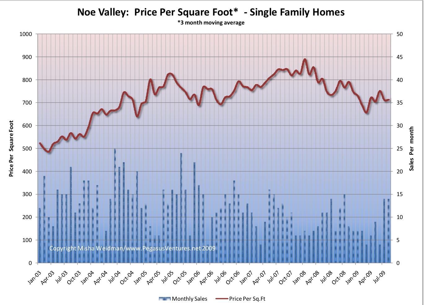
Since I live in Noe Valley, I’ll readily admit that I tend to follow my neighborhood more closely than other areas.   No great surprise there.  So here, without further ado, is a chart showing the price per square foot for single family homes in “core” Noe Valley (click to enlarge).

Noe Valley Price Per SF

Rather than run the chart as Percentage Change From All-Time High, as I usually do, this simply shows price per square foot as a 3 month moving average.  I’ve added the  “number of sales” per month, plotted on the right-hand axis as well.   Note that low monthly sales volumes ( no surprise, given the small geographic area) will make the data less statistically reliable.  In most months, there are less than 15 sales.

While we’re on the subject of sales volume, I recently read an advertisement in the local rag, The Noe Valley Voice, from a local real estate company touting how sales volume in Noe Valley is up, compared to San Francisco as a whole.  So what?  As I’ve stated before in the context of the luxury home market, I really haven’t found any correlation between volume and price.  Though it may be a little difficult to tell from this chart, I don’t see it here either.  For example, sales volumes were down and falling during the autumn months of 2007, but that’s when prices started climbing towards their all-time high in early 2008.  Likewise, sales volumes were increasing through the first 6 months of 2008, even as prices were sliding.

The bottom line is that Noe Valley homes are still fetching north of $700 a square foot, and that’s after a protracted slide.  Sure, the price per square foot is  down substantially from the near- $900 a foot that they hit back in January 2008, but it’s a pretty well-heeled foot nonetheless.

Did you like this? Share it:
Posted in Noe Valley | Tagged , , , | 2 Comments

Measuring by the Foot: Does it Make a Difference?

Several readers and clients have asked me recently about price per square foot metrics.  Certainly, if you’re trying to figure out how much a home is worth, it helps to get a sense of value by knowing what houses (or condos) are going for in the area on a per square foot basis and multiplying that by the size of the house in square feet.  Elementary my dear Watson.

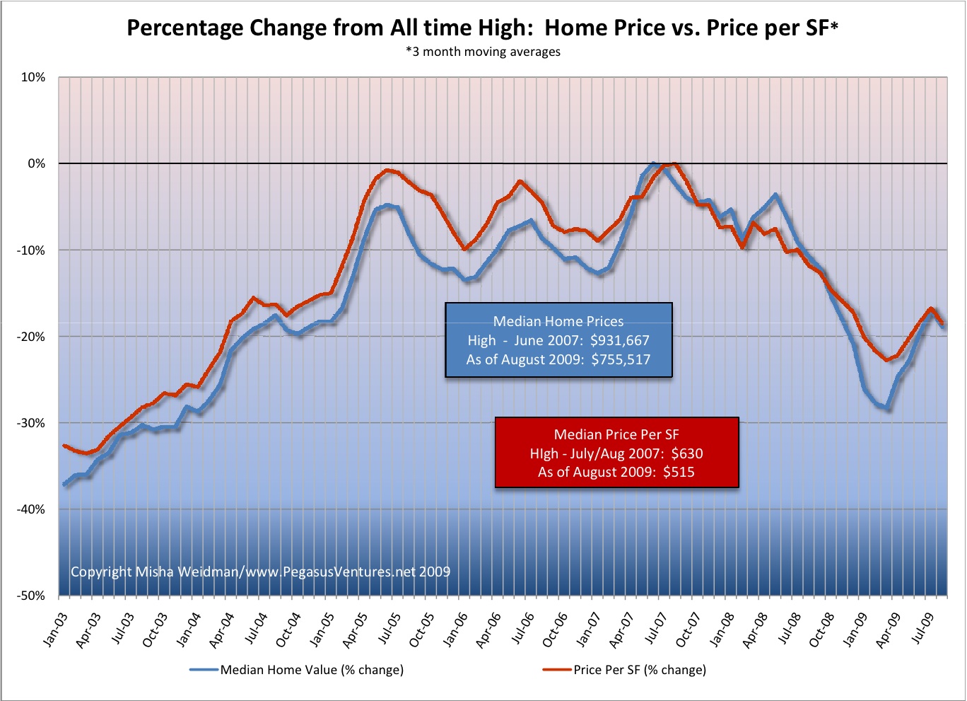
However, others have been curious about whether there might be a discontinuity between the median price of homes and the median price per square foot, and what that might mean, especially in the context of how much each has fallen from its all-time high.  So I decided to take a look.

The first thing I did was check how often price per square foot was not reported in the MLS (Multiple Listing Sales database) that brokers and other real estate tracking companies use to compile their sales data.  Frequently agents don’t report this because they don’t have any reliable data on how big the house is that was sold or they’re afraid of being sued if they’re wrong.  (I recently learned that when you buy a house in France, the seller must tell you how big it is, and if it’s smaller than stated, the Buyer has the right to adjust the price downwards. I wonder what happens if the house is bigger than expected.)

It turns out that in my database, which goes back to October 2002, price per square foot is reported about 80% of the time on single family home sales.  That’s sufficient to be reliable, so here are the results (click to enlarge).

Median Prices Homes vs Per SF

I would say that overall, and as you’d expect, price per home and per square foot have tracked pretty closely.  It is interesting that during the terrible market freeze of early 2009, the median home price dropped noticeably more steeply than the price per square foot.  There are several possible explanations.  One is that smaller homes were selling better than bigger ones.  Since home price can be reduced to the formula: Area (in square feet)  x Price per SF, if home prices are dropping out of step with a drop in price per square foot, then the Area multiplier must be getting smaller faster.  Furthermore, since smaller homes tend to be cheaper homes, this would give some support to the argument that the higher end of the market has been suffering more than the lower end.  Even if that’s true, it seems to have been a short-lived phenomenon given that both metrics are back in sync as of August.

But the truth is that a lot of factors determine the selling price of a house, not just its size.  Location, views, “curb appeal,” to name just a few.  So I don’t really know how much you can glean just from looking at the areas of disjunction.  For my part, I think this confirms that I’m on solid ground if I use median home prices to look at the state of the market over time.  On the other hand, it also suggests that price per SF could work just as well, and it would be more helpful for people looking to do a value calculation for a particular home.  So I might start using price per sf more frequently.  Please chime in with your thoughts and suggestions.

Did you like this? Share it:
Posted in Data, Market news | Tagged , | 2 Comments

Waiting for the Other Sheep To Drop… Or Not

sheep_off_cliff

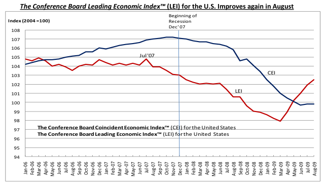
Does anyone really know what’s going on?  Despite the gloom and doom of my recent posts (Waiting for the Other Sheep to Drop, Alphabet Soup:  What Shape will the Recovery Take?), the latest publication of the Conference Board’s Leading Economic Index (LEI) on Tuesday trumpets:  “Fifth Consecutive Increase!”  The LEI is supposed to predict economic activity approximately 6 months into the future, so you’d think that a five-month run would mean it’s time to celebrate, especially given what looks like the impressive bounce shown in this graph.

Picture 1

(The Coincident Economic Index — blue line — shows what’s happening to the economy currently, and — no surprise — it shows we’ve bottomed out.)

To be sure, The Conference Board hedges its bets and says that while a recovery is near, “the intensity and pattern of that recovery is more uncertain.” You can find the full report here.

Meanwhile, today’s WSJ headline reads“Rebound in Home Sales Hits a Bump” , with national sales declining last month after four straight months of increases. (Thank you, X-Man, for the heads-up on this article.)

What does all this mean?  I think it means two things.  1. The worst is over.  2.  You might just as well go consult your magic 8-ball (“signs point to yes,” “ask again later”…) as consult the experts on what the recovery will look like.

Did you like this? Share it:
Posted in Economy | Tagged , , | Leave a comment

Waiting for The Other Sheep To Drop

sheep_off_cliff

I really couldn’t find a suitable graphic for a falling shoe….

Thanks to my reader JC for pointing out the San Francisco Chronicle’s September 21 article on the $30 billion or so in “option ARMS”  that are going to reset, starting in 2010.  These are not the subprime ARMS that caused the derivative markets to unravel, the ones that closet reactionaries are still all too eager to blame on the avaricious poor (now is that an oxymoron?) who signed up for them.

No, these are the the loans that the relatively well-heeled and savvy took out to buy their higher end homes.  They appreciated the “options” an option ARM offered.  Like being able to pay just the interest for the stated fixed period of the loan — often 5 years — rather than paying down the principal as well.  Or even paying less than the interest due and rolling the balance into the principal, just like those negative amortization loans that got us into so much trouble in the 1980s.  (We really never learn, do we.)

According to the article, fully 1 in 5 of every home loan made in the San Francisco Metropolitan Statistical Area from 2004 to 2008 was an option ARM.  Since most of these were 5 year option ARMS, the leading edge of these loans is about to hit market.  Here’s why it matters:

After five years, or once the loan balance reaches a certain threshold above the original balance, the mortgages “recast” and borrowers must make full principal and interest payments spread over the loan’s remaining life…. [N]ew payments average 63 percent higher than the minimum payments, but could be more than double in some cases.

Cynthia Kroll, a very smart professor at the Fisher Center for Real Estate and Urban Economics at UC Berkeley, summed it up succinctly:  “This will be another factor keeping home prices from recovering,” she said.

Could be a long, cold winter.
Did you like this? Share it:
Posted in Loans | Tagged , , | 1 Comment

Focus on Noe Valley

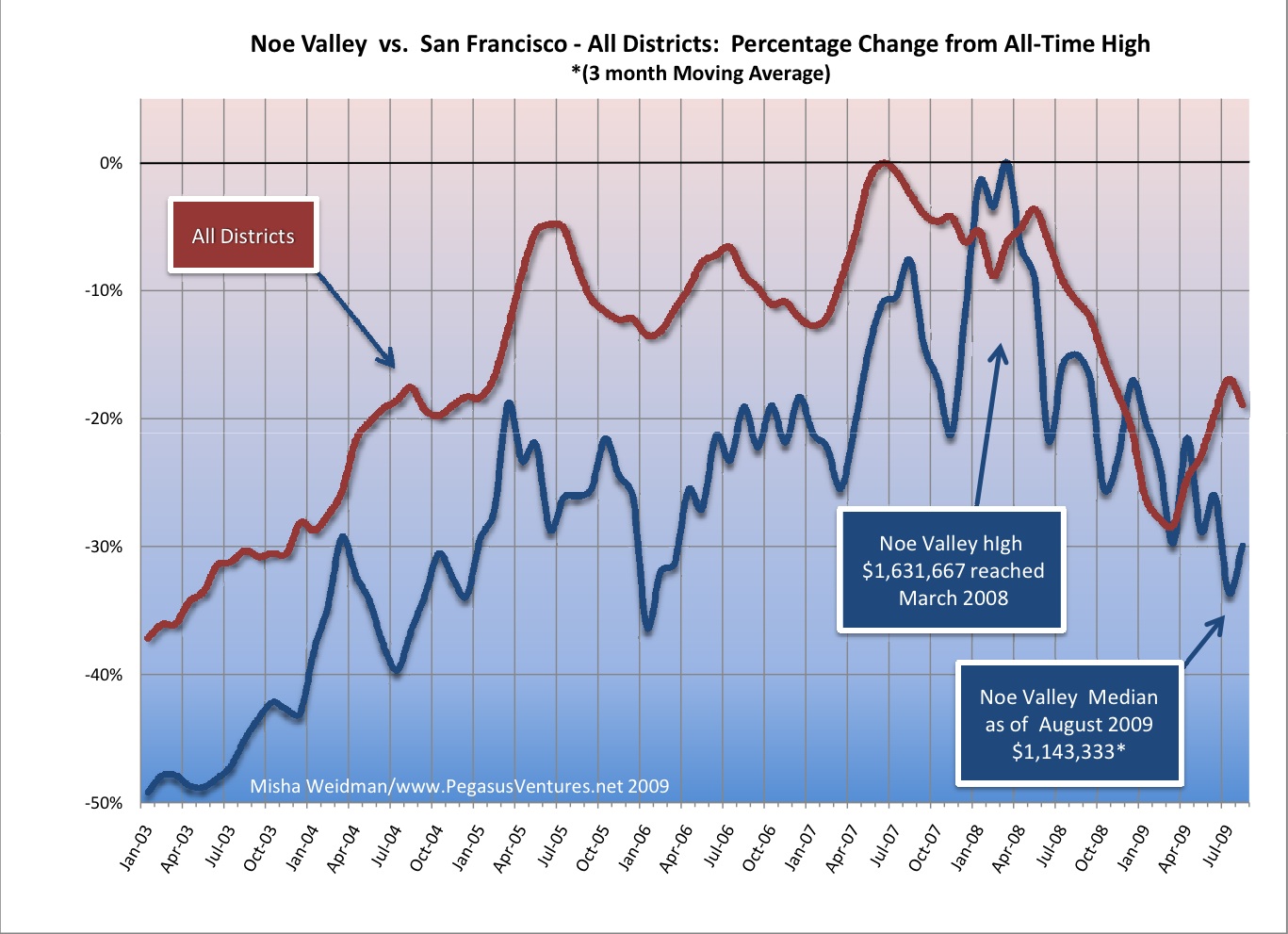
It’s been a few months since I took a look at my own stompin’ ground, Noe Valley, and how prices have been doing compared to the city as a whole.  We dispensed with the notion that Noe Valley was somehow “immune” some time ago.  Sadly — at least for home-owners — and happily for buyers, Noe hasn’t bounced back over the last few months, even though city-wide median prices have improved.

Noe Valley Vs. SF All Districts Percent change August 09

Bear in mind that “Noe Valley” means a very small area.  What’s more, there were only 7 sales in August, down from 14 in May and June, and 22 in July.   Sure, there’s been a bit of an improvement over the previous month, but there’s still an 11% difference between how far prices have fallen for the city as a whole (19%) versus Noe Valley (30%).

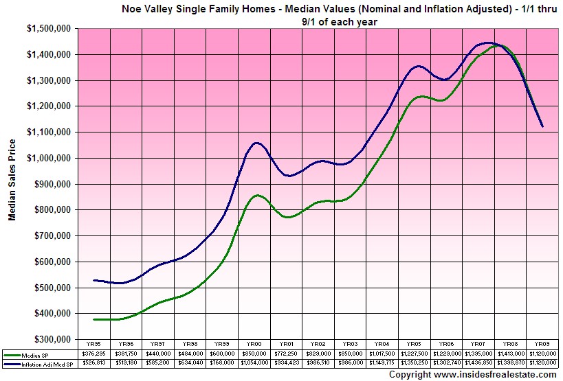
Arrian Binnings over at Inside SF Real Estate also did a recent update on Noe Valley, looking at median prices in a different way.  (I’ve forgiven him for appropriating my term, “getting granular” to discuss what I now have to refer to as “focusing” on a particular area. Sniff.)  Here’s one of his charts.

insidesfrealestate_01-sep-01-18-55

Not much comfort there either.

People will continue to point out that this doesn’t mean that your beloved home has fallen in value as far as the data suggests  — and that’s probably true, unless you bought a median-priced home at the top of the market.  Still, Noe Valley seems unseasonably cold right now, and it’s not just the fog whipping down off Diamond Heights.

Did you like this? Share it:
Posted in Data, Market news | Tagged , , | 3 Comments

Alphabet Soup: What Shape Will the Recovery Take?

CB005684

On the anniversary of Lehman Brothers’ demise and the near-collapse of global markets, it seems appropriate to take a step back from our little corner of heaven for a wider view.

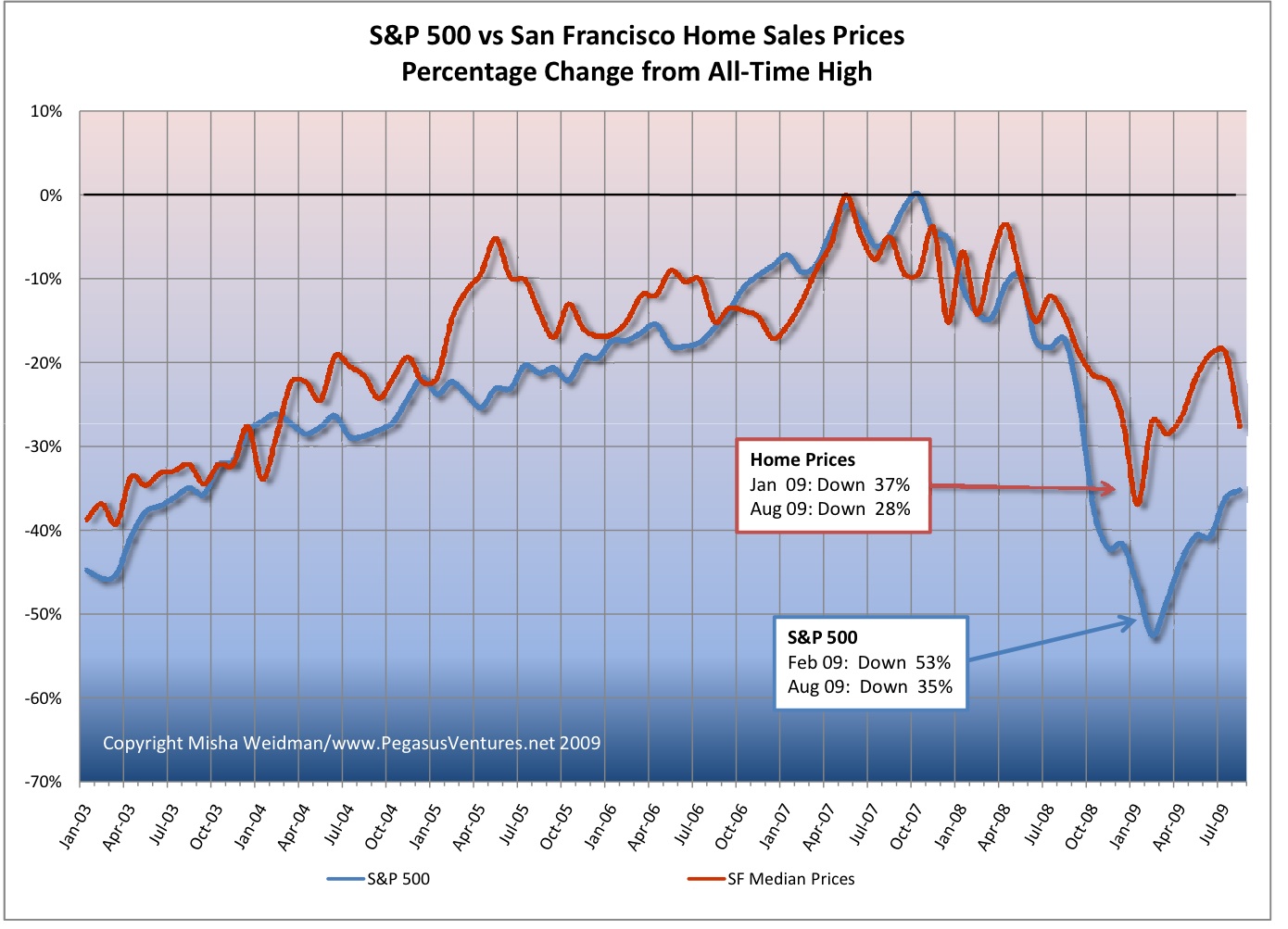
Given where we were a year ago, the world seems to have heaved a huge, if cautious, sigh of relief.  During the chill days of February, the stock market had lost more than half it’s value.  Now it’s down “only” 35%.

San Francisco home prices have also improved.  In January home prices were down 37% from their all-time highs. By July prices had recovered 11%. In August, however, prices fell back 2%.  That’s a pretty stiff drop. (Click the chart for a big version.)

S&P 500 vs SF Home Sales

A sign of things to come?  Who knows.  Everyone seems to have a different letter of the alphabet – or at least the nether end of it — to describe the shape the recovery will take.

Ben Bernanke’s is a long, flat “U”: he thinks we’re on the way, but it’s going to be slow going.

Liz Ann Sonders, Schwab’s chief forecaster and one credited with having seen the train-wreck coming, holds out the possibility of a “V”, in which the economy bounces back like a “coiled spring,” propelled by low inventories and a recovering housing market.  You can dismiss that view as self-serving, but I prefer to give her the benefit of the doubt, especially since she’s been right before. Though I’m not sure she’s right this time.

The one that worries me the most, though, is the “W” , otherwise known as the dead-cat bounce or “double-dip” to cat-lovers.  Nouriel Roubini, no slouch at forecasting himself, has recently said that there’s a “small probability but rising” that we’ll not only run out of steam but fall back again, victim to enormous deficits and the premature closing of global cash spigots, among a host of other ailments.  To that rosy picture, he adds the specter of stagflation, as unsustainable budget deficits lead ultimately to higher interest rates while the economy remains weak.  Perhaps that’s the “X” scenario.

As for San Francisco, the housing market certainly seems sunnier these days, with volume at decent levels.  But I wouldn’t be surprised to see it turning colder, along with the weather.

Did you like this? Share it:
Posted in Economy | Tagged , , , , | 4 Comments