Looking Back at 2009: Half-Empty or Half-Full?

Less than two months into the new year and a brand new decade and already 2009 may seem as far away as a bad dream – assuming you still have a job.

It’s hard to remember just how close to the brink of catastrophe we seemed to be just a year ago.  Major financial institutions – failed.  Credit – impossible to get. Sales—anemic.

With the benefit of hindsight, not to mention survival, some are now criticizing Paulsen, Bernanke, et al., for their haste in rescuing the financial system, but I, for one, will reserve my scorn for the appalling judgment of the likes of Morgan and Goldman and their obscene bonuses.

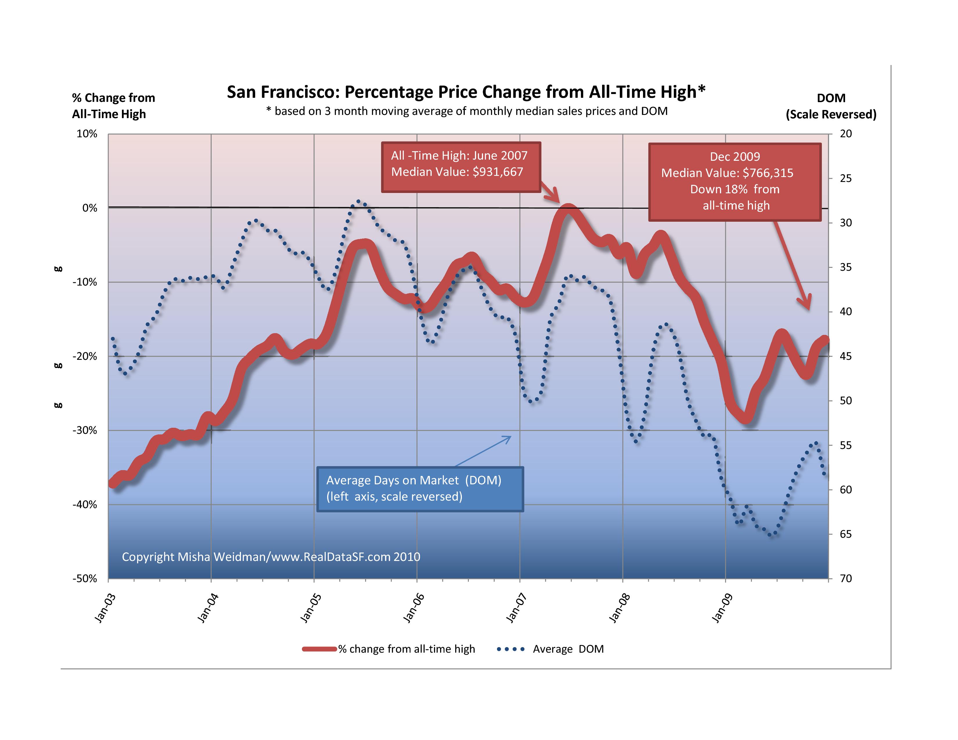
How did the San Francisco market do?  Here’s where we are for single-family homes (click to enlarge).

We ended the year still down 18% from our all-time high of June of 2007.  That puts us at around the price levels of the spring of 2005.  Not great, but during those scary first months of the year when there was no bottom in sight, we were down to price levels not seen since early 2004.

It’s also interesting to see how Days on Market (DOM) inversely correlates with price, at least over longer periods.  In addition to the very regular seasonal dips in price every December/January, it’s easy to see that as DOM lengthens over time, prices decline.  While DOM remained less than 40 days, prices stayed high.  The correlation isn’t perfect – and certainly not on month-to-month time-scales — but it looks pretty good to me.

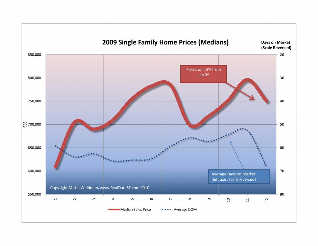
So for the “half-empty” crowd, the bottom line is that we’re still down 18% from our all-time highs.   The story looks much more positive, however, if you look at 2009 in isolation.

Now a 23% gain for the year ought to be making people feel pretty good.  Note that median prices have been in the $700,000 to $800,000 bandwidth for the last three quarters.  The dip in the waning months of the year can be attributed to seasonal factors.

I can already hear the nay-sayers arguing that looking at year end numbers is arbitrary  or, worse, distorts the picture.  (These are the same people who don’t believe in celebrating their birthdays!).

I’m certainly not arguing that happy times are here again.  But , if nothing else, that 23% increase confirms just what a wild ride the last two years have been.

As for 2010, I confess I’m beginning to feel a bit more optimistic than I was a few months ago.  Manufacturing seems to be continuing to expand.  There are some signs of job growth.  Still, Europe is now looking shaky and, closer to home, one should never discount the ability of our politicians to screw up the recovery.

All things considered, though, I’ll take my glass half-full please.

Did you like this? Share it:
Posted in Data, Market news, single family homes | Tagged , , , , , | 3 Comments

Forget Statistics: 714 Duncan Loses 23% in 18 months

Catching up on the endless paper-work the other night, I came across that rare thing:  a property that sells twice in a relatively short time with no major renovations performed in the interim.

This “sales matching” technique is what the folks at Case-Shiller use to create their Indexes of property values across the country.  Part of the reason they can is that their indexes are generated for large Metropolitan Statistical Areas with lots of house sales.  And even so, they use a lot of fancy foot-work to “match up” properties.

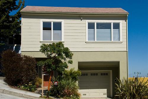
So now comes 714 Duncan Street, a beautiful 2,000 sf view home on a steep hill with fantastic city views.  Listed at a disarming $1,195,000, it sold for $1,415,000 in January 2008.  That was pretty much the top of the market for Noe Valley.  (You can see the chart here.)

Fast-forward 18 months.  The same house sells for $1,095,000 in June 2009.   That’s a drop of  22.6%.  My analysis of all Noe Valley sales for the same period shows a drop of just under 25% for the same period.

There’s something of a “duh, so what” to this story.   But I’ve seen enough nay-sayers  (on other blogs, of course!) who argue that tracking statistical medians are meaningless that I thought it was worth posting this as a powerful—and sobering —  case to the contrary.

Did you like this? Share it:
Posted in Data, Market news, Noe Valley | Tagged , , | 2 Comments

The View From Space: 2010

The View From Space

The View from Space – 2010

Ken Rosen is a smart guy.  He’s the co-chair of the Fisher Center of Real Estate and Urban Economics at the Haas School of Business at UC Berkeley and the investment adviser of choice to some of the biggest players in real estate, from banks to insurance companies to REITS. Ken might not be able to appraise your house, but he could tell you how each sector of the real estate economy has fared anywhere in the country, and probably in many parts of the world.

Once or twice a year I spend the day in a windowless hotel conference room listening to Ken and some of the biggest heads in the real estate biz expounding on the state of real estate. These guys (and they are mostly guys) look at real estate through the lens of global macro-economics and finances.  Want to know where interest rates are going?  They study yield curves on T-Bills and monetary policy in the capitals of Europe.  This is “the view from space.”

I reported on Ken’s predictions from November of 2008 here. (Remember, we were already in deep doo-doo, though things got worse through the first quarter of 2009.)  Before moving into his predictions for 2010 and beyond, I thought it would be useful to see how well he did on on his forecasts for 2009:

The Ken Rosen Scorecard for 2009

  • Chance of a deep recession: 70%. Bingo.
  • S&P 500 at year-end under a deep recession: 850. Actual:  1115.   Woops (but who said the market was rational?)
  • The dollar: “Will continue to do well.” Nope, it lost ground.

Not a great batting average you say?  Truth is, I’m cherry-picking here.  Overall, Rosen’s message in November 08 was that things were improving, but that there would be volatiility and a long, slow recovery in housing.  Notwithstanding our brush with death in March  — Rosen put the chance of a deep recession at 5% — his prediction on that aspect of the market seems to be holding up well.  As for the dollar, given the gaping chasm that faced the global markets in the early months of 2009 – led by crashing and burning US financial institutions – the dollar’s decline shouldn’t be a surprise.

And as for the stock market and its amazing recovery, given what still seems to be looming on the horizon, I just can’t figure that one out at all.

Rosen’s Predictions for 2010

In terms of the shape of the recovery, Rosen estimates the chances of a “broken W”  — read fragile recovery – at 65%.  This is where I’m putting my money folks.

He estimates the chances of a more robust recovery at 25%, and that of a long , Japanese-style recession at 10%.

Expect a slow, fragile recovery, a bottoming out of the housing market, and rising long-term rates.

Estimates for the Stock Market, Year End 2010

S&P  1150; Dow 11,000

Advice for the Home-Buyer:

If there’s any good news here, it’s that Rosen thinks that the sector will come back fastest is single family housing.

Here’s the takeaway quote:

“Take advantage of the windfall tax credit and low interest rates if you’ve got a good job”

Rosen thinks that prices have bottomed (I’m not so sure).  But it does appear that

REO’s (properties taken back by the banks) have declined as a percentage of all sales, and that should help to stabilize prices.

From a socio-economic perspective, housing affordability has increased significantly due to low interest rates and price declines, and that can only be viewed as good if you believe that widespread home-ownership is a public “good.” (I do.)

What could go wrong?

In a moment of brilliant serendipity, Rosen’s co-chair at the Fisher School, Bob Edelstein — no small brain himself —  happened to sit next to me at lunch.  In the next 30 minutes we covered everything from wine to Waziristan.  His outlook was not as sanguine as Rosen’s.  We didn’t get into details, but my impression was that Edelstein was more concerned than Rosen about a jobless recovery coupled with higher interest rates driven by enormous deficits.

Once again, the magic eight ball says:  “Ask again later.”

Ask again later

Did you like this? Share it:
Posted in Economy, Market news | Tagged , , , , , , | 2 Comments

New Year’s Greetings

new years 2010

Another glorious winter’s day in San Francisco.  My family and I biked over the GG Bridge to Sausalito and then took the ferry back to Fisherman’s Wharf. Thirty-five years in this town and I’ve only done that ride twice.   The previous time was a week ago, to celebrate my 10 year old son’s new birthday bike.

2009 was not a kind year.  I feel very grateful that my family has come through in reasonable shape.  It makes it easy to appreciate the fine views and the fine weather.

Exactly a year ago, I officially launched this blog. It’s been enormously gratifying writing it.  First, it’s made me feel plugged into the market in ways both large and small.  Secondly, because I’m a visual kinda guy, those charts that I’ve tried to make a central part of  this blog have helped me understand and retain what’s going on in ways that columns of numbers just don’t.   Plus, I’ve learned a heck of a lot more about Excel — and, alas, its limitations as a database —  than I ever knew before.)

And finally, it’s been great to feel appreciated!   Though I sometimes joke that I have a readership of 7½, it is a loyal, thoughtful and appreciative one.  Well, that’s three of you anyway. 🙂

Happy New Year everyone!  My best wishes to each of you, and thank you for your support.

Did you like this? Share it:
Posted in Blogging, Personal | Tagged , , | 2 Comments

A Faltering Housing Market?

George may have left office a year ago, but there appears to be a growing consensus that the likely shape of the recovery will be a “W.”  How appropriate, if you believe that we are reaping the bitter fruit of his administration’s policies.

A front page article in the Business Section of last Wednesday’s New York Times, grimly entitled An Upturn in Housing May be Reversing,” pulls together recent and contradictory data from various sources, including Case-Shiller, Moody’s, and The National Association of Realtors.  The conclusions are sobering.

There is a growing consensus that the positive national sales data that we’ve seen over the last few months is faltering.  Much of the recent activity, for example, was stimulated by the anticipated expiration of the “First Time Home-buyer Tax Credit,” originally set to expire in November, and now extended through April of next year.  Essentially, this means we’ve “borrowed” from future sales.

Also, despite some positive economic news and decent sales volumes, there’s been little improvement in sales prices because inventory levels – read “foreclosed properties” – remain so high.   Mary Maitland, VP of the S & P Index that publishes the Case-Shiller Index foresees a “W” pattern for the housing market, with prices this winter testing the lows we saw earlier in the spring.  Am I allowed to say “I told you so?”

The NY Times article has a cool interactive chart for specific MSA areas including “San Francisco” — remember this covers 5 of the 9 Bay Area Counties.

Did you like this? Share it:
Posted in Economy, Market news | Tagged , , , | 1 Comment

Continued Improvement in the Housing Market or Borrowing from the Future?

CB104955

The National Association of Realtors (NAR) reported yesterday that existing home sales in October rose to their highest level in more than two years.  Nationally, sales were up 10.1% over September and up 23.5% year over year.

Most of the increase in sales, however, was not in the western region, where sales were  only up 1.6% from the previous month.  (Oh, the devil is always in the details.)  And more “good news”:  The western region median price of $220,200 — clearly this is not San Francisco — was down 14.7% year over year.

Not surprisingly, the article stresses the positive.  Inventories are shrinking, especially at the lower price levels where foreclosures and REOs are slowly being digested by the system.  Prices have fallen by the smallest amount in over a year (don’t you love that!).

You can argue that any press release by NAR is going to be self-serving, but its Chief Economist, Lawrence Yun, doesn’t mince words when he says that a lot of the sales surge was fueled  by the anticipated expiration of the First Time Homebuyer Tax Credit.  The $8,000 tax credit was originally scheduled to expire in November, but has now been extended  through April 30, 2010. Yun goes on to caution that “with such a sale spike, a measurable decline should be anticipated in December and early next year before another surge in spring and early summer.”

We can only hope that he’s right about that surge….

Did you like this? Share it:
Posted in Economy, Market news | Tagged , , | Leave a comment

TICs, San Francisco’s Involuntary Reflex — Part 3: The Condo Premium Per Square Foot? Or not…

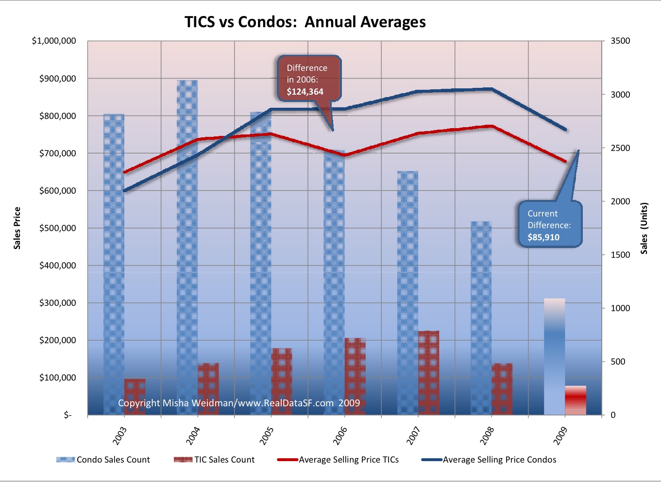
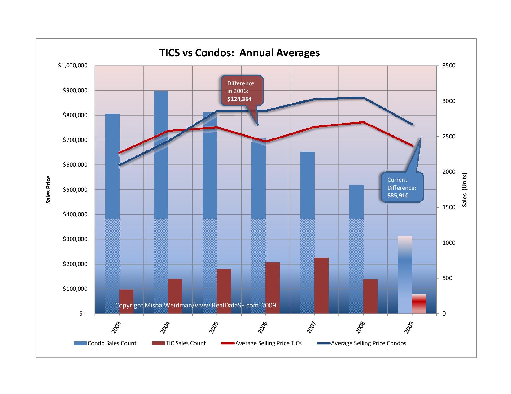
Last post, we determined that the current difference between the average (annual) price of a condo and that of a TIC is  $86,000, down from a high of $124,364 in 2006.  (That’s a 30%+ drop, by the way.)  Here’s the chart again (sorry for the funky transparency on the sales volume bars).

Condos vs. Tics Annual Average Sales Prices

That’s useful if you’re looking at an average-priced TIC and you’re curious about how much of a premium you’d have to pay for an average-priced condo.  But how about reducing that to a per square foot premium?

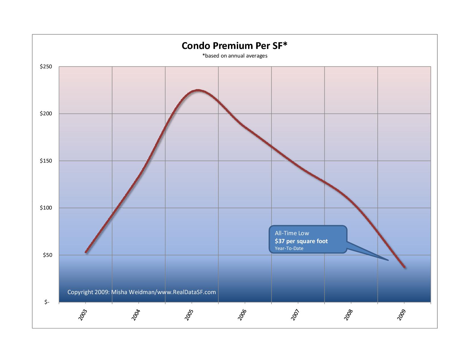
For those who just want the bottom line, here’s the answer, but it’s worth reading on for the caveats.

Simple Condo Premium Per SF

$37 a foot doesn’t sound like much of a condo premium to me, that’s for sure.  And as my astute readers will note, the drop in price on a per square foot (from around $225 per sf) is obviously much more than the drop in median sales prices shown in the previous chart.

What’s going on?  It’s really simple:  there’s a lot less information on sales price per square foot for TICs.

All my data comes from the MLS (Multiple Listing Service) that real estate brokers use to find and market properties.  When a sale’s completed, they are required to enter the sales price.  If there’s information on the square footage of the property — provided by the owner or more frequently from the property records — the database calculates a per square foot price.  Roughly 80% of condo sales have a recorded price per square foot in the MLS.  Only 45% of TIC sales have a recorded price per square foot. How bad is that? In September 09, there were just 27 TIC sales.  Only 9 of them had a recorded price per square foot.  For all of 2009 through September, there were 275 TIC sales.  Only 113 – 41% – show a per square foot price.

There are lots of people — mostly on other blogs 🙂  — who love to trash statistics and say they’re meaningless.  Medians don’t reflect home values, etc etc.  I disagree.  Provided you have enough data  and you understand what you’re measuring, statistics help make sense out of what is otherwise undifferentiated data.  But I am afraid that in the case of measuring the condo premium on a per square foot basis, we are in dangerous low on data.

One final reminder:  For this series of posts, my TIC data includes the handful of stock cooperative sales that occur in this market.

And thanks for sticking with me on this long series of posts….


Did you like this? Share it:
Posted in Condominiums, Data, Tenancy In Common | Tagged , , , , | 3 Comments

TICs, San Francisco’s Involuntary Reflex: Part 2 — The Data

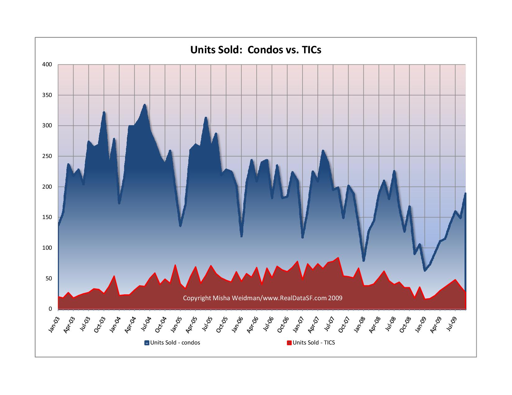
There are weeks when I look through the new listings on the MLS (Multiple Listing Service) and it seems like there are more TICs for sale than condominiums.  Turns out, this just isn’t true.  Here’s a chart showing relative sales volumes since 2003 (click to enlarge).

Units Sold By Month
Look at that!  Excluding those wonderfully regular dips every Xmas, condo sales are generally at around 200 units per month.  TICs rarely break 40.

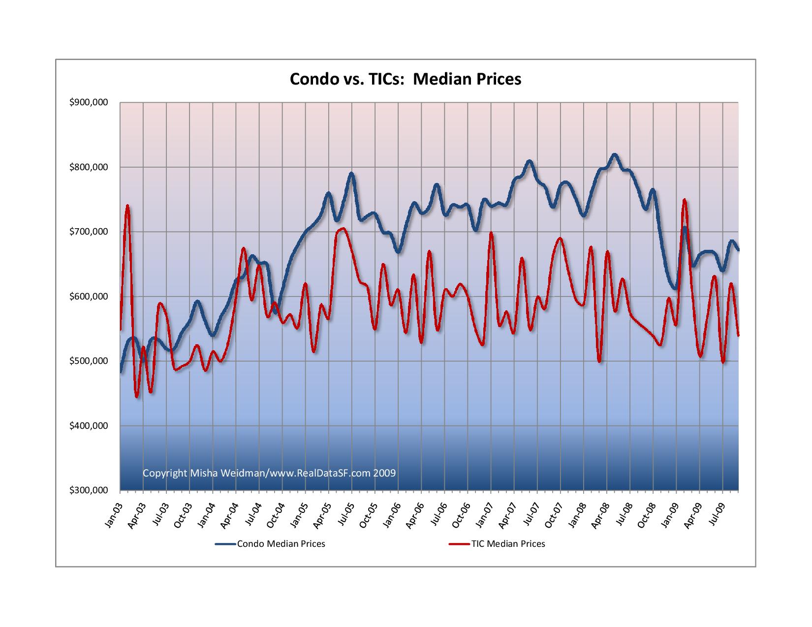
Here’s how TIC and condo median prices stack up against each other on a monthly basis.

Condo vs TICs Median Prices By Month
Dueling spaghetti you say?  That was my reaction, too.  The huge variability in prices from month to month on the TIC line is a direct result of the paucity of sales.  And this chart certainly doesn’t help get at the key question, which is this:

Given that TICs are riskier and less flexible than condos, what’s the premium that you pay for buying a condo vs.  a TIC?

In fact many TIC buyers do so with the hope of being able to realize this “premium” by converting their TICs into condos down the road.  Fat chance unless you’re buying a TIC in a two unit building which — for now at least — remain exempt from San Francisco’s byzantine annual lottery system.

Luckily, I have a bona fide statistician mathematical genius phd for a wife, and she always lends a hand on methodology when I need it.  She suggested that where one set of data (condos) is so much larger than another, using averages provides a more reliable “apples to apples” comparison than medians.   Also, with so few monthly TIC sales, I decided to look at annual rather than monthly trends.

Here’s attempt number two.

Condos vs. Tics Annual Average Sales Prices

Much more useful!  (By the way, the fact that TICs were more expensive than condos in 2003 and 2004 can be explained by a few massively (in excess of $8 million) expensive TIC sales in those years.  This is a great example of how using medians or averages can really affect the results.)

So, can we drill down further and come up with a condo premium per square foot? Stay tuned….

Did you like this? Share it:
Posted in Condominiums, Data, Tenancy In Common | Tagged , , , , , | 3 Comments

TICs, San Francisco’s Involuntary Reflex: Part 1

Inconvenient and Ugly

A tic is an involuntary and habitual muscle spasm, frequently in the face.  If you live in San Francisco, a TIC is also what many people end up with when they buy a flat in one of San Francisco’s classic 2-4 unit buildings.  Like the medical condition, TICs are inconvenient at best and can be downright ugly at worst.

TIC stands for “Tenancy-In-Common,” a form of legal title by which multiple owners take title to a single property.  In San Francisco, this form of taking title has come to be used as an end-run around the City’s restrictions against converting multi-tenant buildings into condominiums.

When you buy a condominium, you’re basically buying your particular unit and that’s all. But when you buy a TIC interest, you’re buying an interest in the building as a whole, along with your other TIC owners.

Lawyering Has Its Limits

Why does it matter?  Because buying a roof over your head is expensive.  Most of us need to borrow money to do it.  And the major disadvantages of TICs over condominium ownership relate to financing issues.

  • When you buy a condo, you get a loan on your unit and that’s all.  If you don’t pay your loan and the bank forecloses, they have the right to sell your condo to get repaid, but they don’t have the right to sell the building the condo is in.
  • But when you buy a TIC, in the vast majority of cases you and your co-owners become co-signers on a loan for the entire building.  You qualify for the loan together and you are “on the hook” together for repaying it.  If one of the co-owners stops paying his share of the loan and the others don’t feel inclined to make up the difference, the bank has the right to sell the entire property at a foreclosure sale.  That itself would be enough to give many prospective buyers a twitch or two.
  • There are a few banks that will finance separate TIC interests.  This pretty much puts the TIC on a par with a condo.  But interest rates are higher than on a regular condominium loan; and the building itself needs to “qualify” for the program.  Also, although these kinds of loans have been around for a while and seem to have survived the credit crunch, there’s no guarantee that they’ll continue to be around.
  • Selling a TIC interest can also be more difficult than selling a condo. If the lender doesn’t permit the buyer to take the seller’s place as a co-signer on the loan, the owners may be forced to take out a new loan to accommodate the new buyer.  If the lending environment isn’t good, that can kill the sale.  Or the bank can use the sale to try to extract better terms for itself.

It’s true that clever lawyers – and I say that without any irony – have developed legal structures to mitigate these risks.  Andy Sirkin and Andrew Zacks are two prominent attorneys who specialize in this stuff.  (See their websites for excellent in-depth material on TICs.) But TICs remain inherently riskier and more complicated than condominiums, and no amount of legal engineering can fix that.

Tomorrow we look at the market data for TICS and condos.

Did you like this? Share it:
Posted in Condominiums, Tenancy In Common | Tagged , , , | 5 Comments

Fears of a New Chill In Home Sales

winter home

That was the title of an October 27 article in the New York Times, and, as one of my readers and clients pointed out, it’s what I’ve been tentatively suggesting as a possible scenario for this winter. See here, for example.

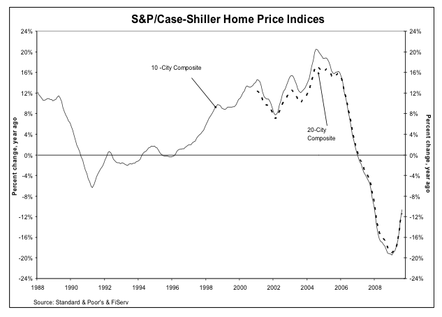
And, ironically, the gloomy head-line announced yet another “positive” month of data from the Case-Shiller Home Price Index. The little up-tick in the index from last month’s July data that I discussed as a possible “dead cat bounce” continued in August.

Picture 4

“San Francisco”  — remember, this is a Metropolitan Statistical Area (MSA)  consisting of 5 of the 9 Bay Area Counties — improved 2.6% on a seasonally adjusted basis from July 09.  The New York Times has a cool inter-active chart that shows the CS Index for various MSA’s here.

So why so glum?  The NY Times article points to a number of factors that suggest the improvement may not continue:

  • an unexpected fall in consumer confidence in October.
  • the end of the stimulus provided by the first-time home-buyer tax credit (though there’s pressure to extend this).
  • doubt about how long the The Fed will keep interest rates so low.

Especially troubling for California is “strong evidence that foreclosures may be spreading from sub-prime inland areas to the more exclusive coastal region.”

My view hasn’t changed.  If you’re thinking about buying, this is probably a good time to be out there looking, with a view to buying some time during the winter months when activity slows and prices tend to soften somewhat.  Nobody knows how long interest rates are going to remain low — and some economists think that they may well remain low for a while — but with the government having thrown so much money at the economy to keep us from the brink of disaster, it’s hard to argue that the long-term trend is going to be anything but up.

As for whether we’ve hit bottom yet, it’s anybody’s guess.  While Mr Case of Case-Shiller continues to think that the worst is over, the NY Times article quotes another eminent economist who thinks that the recent improvement in the CS Index is an aberration and who wouldn’t be surprised by another — if limited — down-leg.

It’s a fool’s game to try to time the market to the nth degree.  And in this environment, with so many contradictory signs pointing in so many directions, you might as well flip a coin, or an economist, and see whether he lands on his head or his arse.

Me, I’m dusting off my magic 8-ball.

magic_8_ball_3

Did you like this? Share it:
Posted in Data, Economy, Market news | Tagged , , | Leave a comment