The Excelsior, Bayview, Hunter’s Point, Oceanview, Ingleside: these are some of the neighborhoods included in the San Francisco Association of Realtors’ MLS (Multiple Listing Service) Districts 3 and 10. It’s been suggested here and elsewhere that perhaps these non-“core” San Francisco neighborhoods have been pulling down San Francisco’s home prices disproportionately. The theory, plausible enough, is that these more modestly-priced neighborhoods would be feeling the effects of the economic slowdown more than the tonier “core” neighborhoods, whose denizens’ bank accounts might provide a little more padding against hard times.
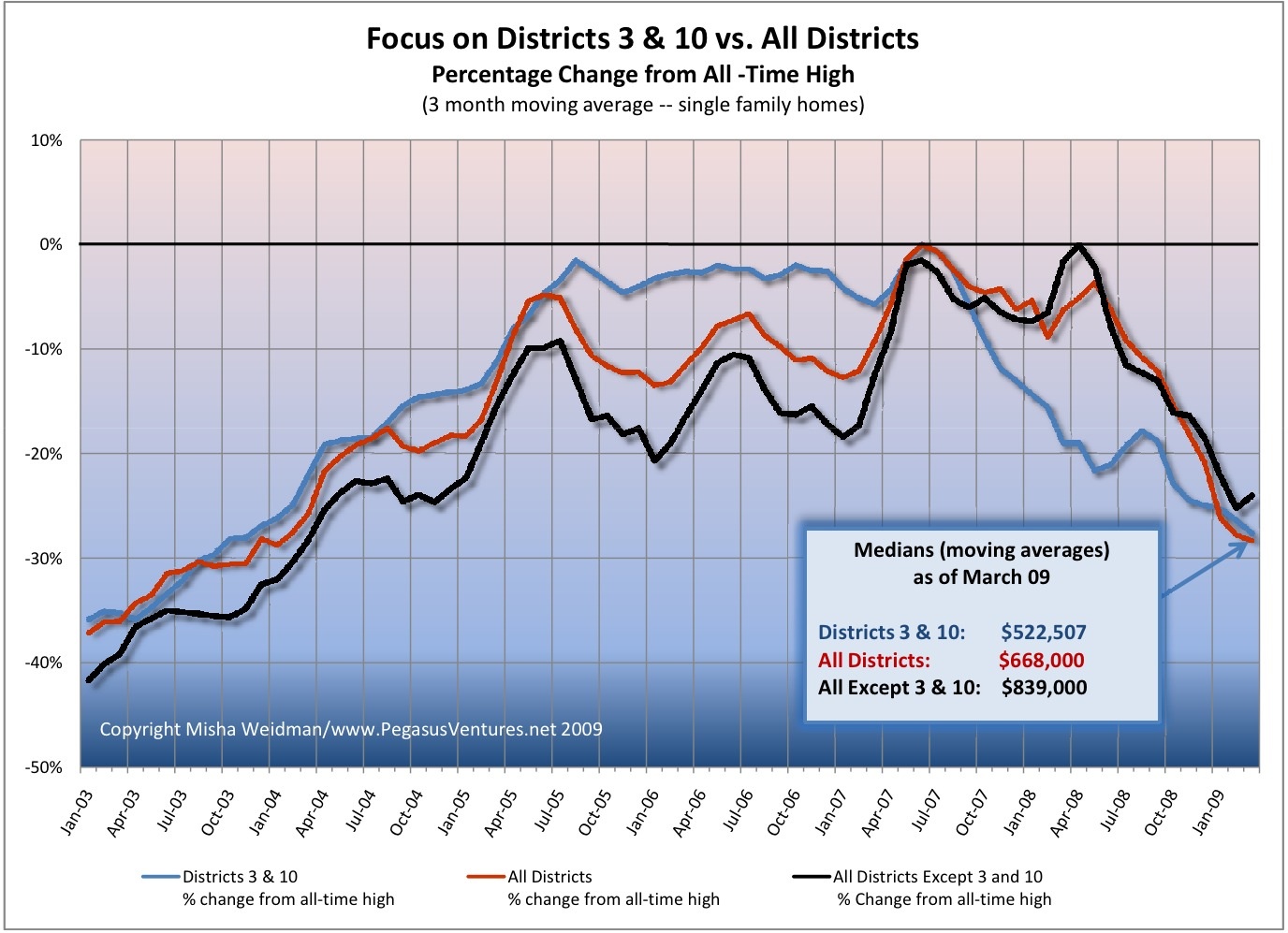
I recently published a chart that compared the percentage change of Districts 3 and 10 from their all-time highs to that of the city as a whole. Some readers of theFrontSteps expressed an interest in seeing what the chart would look like if you excluded those districts from the data set for the city as a whole. (Districts 3 and 10 make up over 20% of the city’s single family home sales for the 5 year period covered by the chart.) I aim to please, so I ran the numbers again and here are the results.

The chart confirms, once and for all, that however you want to cut it – with or without Districts 3 and 10 – home values for the the “core” San Francisco Districts have fallen almost as far as those for the outer Districts. They just took a little longer to start falling, that’s all.
Bottom line: We don’t have Districts 3 and 10 to kick around any more. I’m going to start rolling out comparisons of specific districts and neighborhoods to the city as a whole (ie. “All Districts”), starting with some that have supposedly weathered the market reasonably well. I think you’ll find the results surprising. I know I did.
No tags for this post.
It would be interesting to see this data normalized so that “0” was the start date of Jan 03, rather than the peak.
Pingback: The Worst May Be Over According to Big Brain, Ken Rosen | Misha's Musings