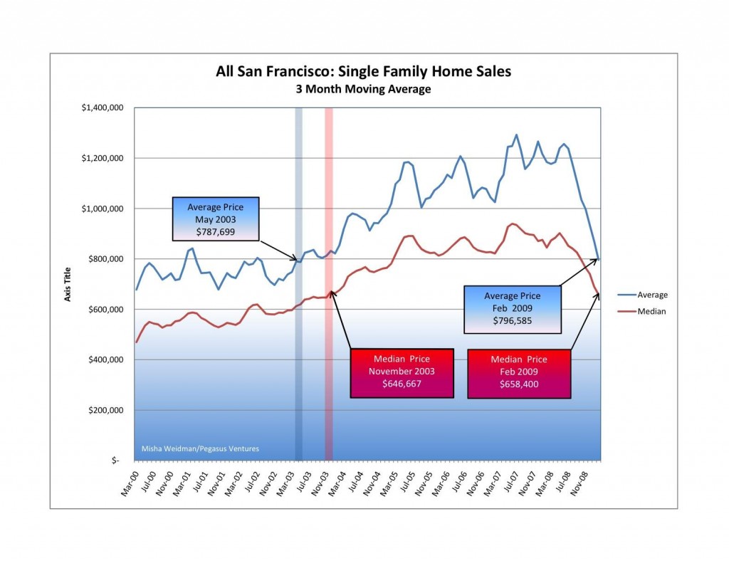
Not long ago I did a guest post at The Front Steps in which I showed that city-wide home prices had fallen back to November 2003 levels. Here’s the chart.
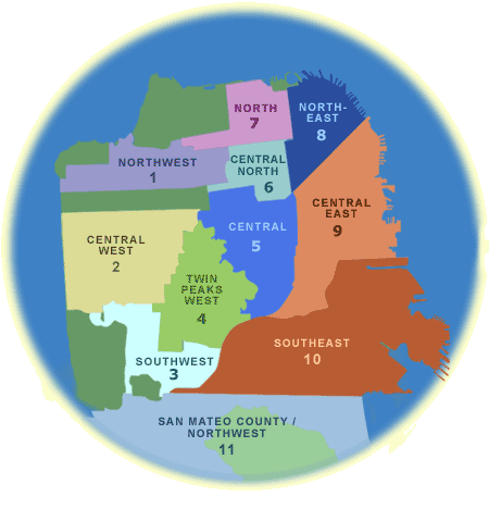
That prompted some discussion about whether the results would be different if you excluded home sales in some of San Francisco’s outlying areas, such as the Bayview and the Westlake districts. These and other neighborhoods are included in MLS (Multiple Listing Service) Districts 3 and 10. Here’s the official MLS district map.
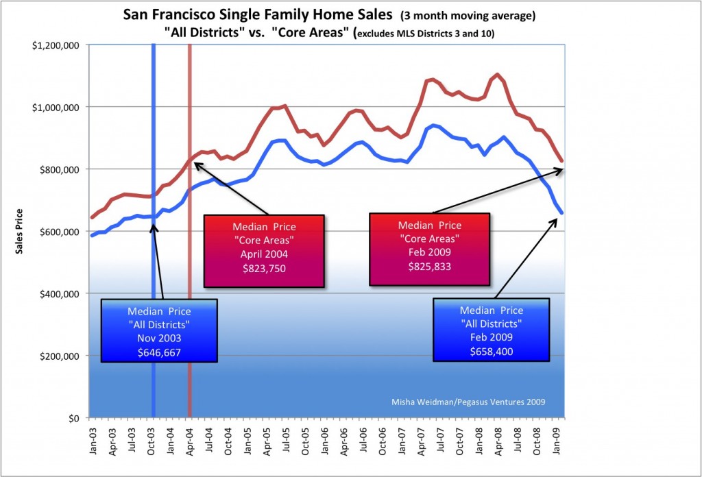
The thinking, mine included, was that San Francisco’s generally more expensive “core” areas would have held up better than the more modestly priced outer areas, where the economic downturn could be expected to have had a greater and more immediate impact. Did they? I recently posted this chart at The Front Steps as a partial answer.
What’s really interesting about this chart is how closely the “Core Areas” and “All Districts” price lines track each other. This isn’t altogether surprising since the “Core Areas” data overlaps with over 75% of the “All Districts” data. The fact that “Core Area” prices are higher also isn’t surprising.
But have “Core Areas” been holding up better than the city as a whole? Based on this chart, I thought the answer was “yes”, since it shows an increasing price divergence in favor of “Core Areas” starting around July 2007.
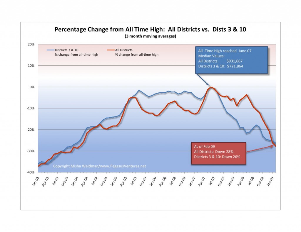
Still, the divergence was relatively subtle, so I decided to take another stab at answering the question. This time, I focused directly on Districts 3 and 10 and compared the results to the city as a whole. I also looked specifically at how far prices had fallen from their respective all-time highs. Here’s the resulting chart — note, this is single family homes only, not condos (click to enlarge) .

In both cases, all-time highs were reached in June 2007. What this chart clearly confirms is that prices in Districts 3 and 10 really did fall further and faster than prices for the city as a whole. Initially, that is. Starting around July 2008, prices dropped off a cliff city-wide. As of February 2009, Districts 3 and 10 are actually doing slightly better than the city as a whole.
I will spare you the details of my travails with Excel, pivot tables, and generating median values for large data sets. Not fun – and the principal reason why I haven’t posted for a few weeks. However, I do think that this chart allows us to conclude that “Core Areas” haven’t performed substantially better or differently than the city as a whole. Much ado about nothing you say? Perhaps, but at least we’ve now established a baseline — sort of like the S&P 500 — against which to compare specific neighborhoods and areas. Stay tuned.


Really it shows that efforts manipulating data do not show when they turn into a nice graph. I will say Mr. Misha that you should focus on the P/E ratio of the real estate market and tell us about how the rental market is holding up. Then you could focus on unemployment numbers and superimpose the 3 charts. Demographics will have a lot to do with the pace of the decrease in prices, or not!
Pingback: Case Shiller Chimes in With Good News: US Down only 17%! | Misha's Musings