Sorry, folks, but it’s that bad — or good, depending on your perspective.
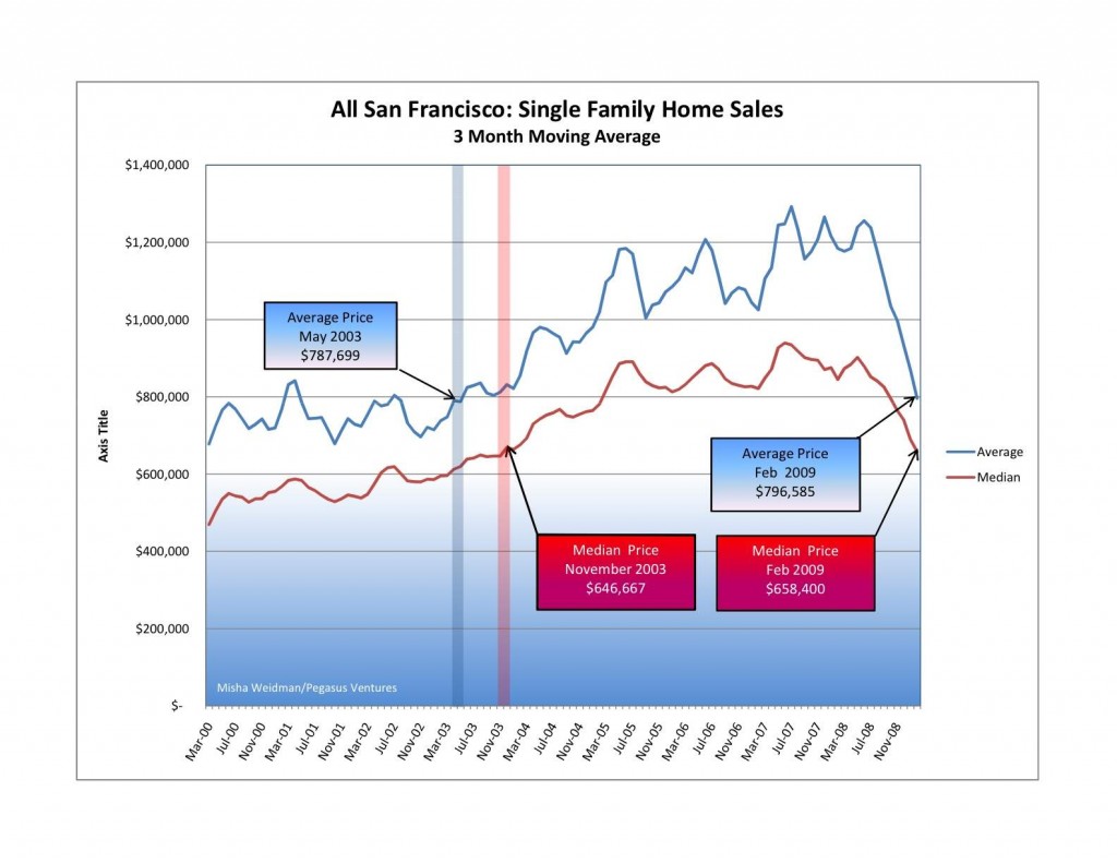
I tracked average and median prices going back to 2000 for the ten combined MLS districts that comprise the San Francisco Multiple Listing Service — the big database that realtors use to list properties and record sales information . (The MLS District Map is here, on my Market Trends page.) Here are the results (click to make the chart bigger):
Pretty scary stuff, especially when you look at the suislide (a new word is born?) that started in June of last year and shows no signs of slowing down.
Before you head for the windows, or call your realtor (me!) to start looking for a house to buy, consider this: as I’ve said before, there’s nothing so local as real estate. It really does matter what neighborhood you’re talking about. This chart, while it does illustrate something meaningful about the overall SF market, doesn’t tell you anything about values in any particular neighborhood. It lumps together data from neighborhoods as diverse as Hunter’s Point and Visitacion Valley in District 10, which has been slammed for well over a year now, with neighborhoods like Noe Valley in District 5 and St. Francis Wood in District 4, both of which seem to be holding up pretty well. Go to my Market Trends page to see the charts for individual districts. I’ll be creating charts for individual neighborhoods within districts for future blogs.
And if it’s any consolation, SF real estate is holding up a heck of a lot better than the stock market, don’t-cha-know. Today the S&P 500 closed at 682.55. The last time it closed under 683 was on May 17, 1996.


Pingback: Reader Reports: San Francisco Median & Average Home Prices 2000 versus 2008 | San Francisco real estate insight, statistics, gossip, and news with a twist and some flavor - theFrontSteps