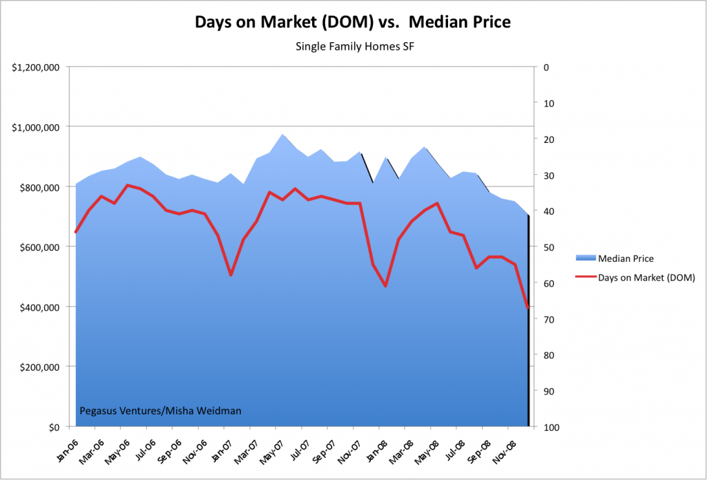
A couple of posts ago, we dispensed with Absorption Rate as a good barometer of the market since there appeared to be no correlation between how much inventory was available in relation to sales rates and where median prices were going. I asked whether there might be a different metric that would correlate better, like the oft-quoted Days on Market or “DOM.”
In essence, DOM tracks the average number of days that properties have been on the market from the time they became active on the MLS (Multiple Listing Service used by realtors) to the time they actually sell.
Great minds must think alike because it turns out that my friends over at Inside SF Real Estate have been exploring the same thing. Head over to their recent post for a look at DOM trends over 14 years. What they haven’t done, however, is track DOM against median prices. Ha! I have, and here are the results for the last three years tracked by month (my numbers are pulled directly from the MLS database — click to make the chart larger).
Now that’s what I call correlation! Note that the right-hand Y axis tracks DOM inversely, with longer periods at the bottom and shorter periods at the top. So, this chart is basically showing that during periods, even relatively short periods, when the average DOM falls, prices rise, and when properties stay “on the market” for longer, prices fall. This is just what you’d expect.
Why? My guess is that DOM captures many of the factors in play in the real estate market at any given time. For example, if credit is tight and appraisals are rigorous, you’d expect that transactions would take longer to get approved. Likewise, if lots of people are bidding on the same house, you’d expect that the winning bidder would promise a quick “no contingency” close and that there would be no haggling on the sale price. When the market slows, you’d expect more cautious buyers, more haggling on price, longer closing periods — all reflected ultimately in the DOM.
As my friends over at InsideSFRealestate pointed out in their post on DOM, realtors can play games with DOM. For example, if a property doesn’t sell, they’ll take it off the market, and then put it back on as a “new listing” at a lower price and voila, the DOM resets to zero. Still, that would just tend to increase the “down” side of the line — the correlation would still hold.
The only other point I’d add is to note the seasonal trend in the chart. It seems that every December/January, DOM increases and prices dip. Perhaps that’s the best time to buy.


Nice analysis and commentary, Misha. Speaking of correlations, I’ve been trying to figure out a local economic indicator that has accurately predicted housing prices in SF over the long term. Wouldn’t that be a nice piece of info to have? Any ideas which tree(s) I should be barking up? -Arrian
Arrian: good question. Here’s one guess at a forward indicator: mortgage interest rates. The questions may be how “forward” and whether the old rules still apply.